
Typography
as a tool
for queer resistance
After more than fifty years of celebrating Pride, it is important to return to its origins. Pride did not begin as a celebration, but as a political uprising demanding queer rights, visibility, and liberation.
Over time, however, its radical and confrontational nature has gradually been softened through commercialization and depoliticization. As Pride increasingly shifts away from its activist roots, reflecting on its history becomes more essential than ever. Looking back at the origins of Pride allows us not only to understand the struggles that shaped queer visibility, but also to understand (or to reconsider) what it truly means to be queer today.
Handmade posters, banners, and underground zines became essential tools for sharing information, building community and expressing political demands. These materials represented far more than mere communication; they were acts of defiance and empowerment. To understand the visual roots of queer resistance and the origins of Pride, it is therefore imperative to examine how printed materials shaped meaning through text, design, and print culture.
Design Is Not Neutral
Typography, the design and arrangement of text, refers to the visual organization of letterforms, spacing, and layout. While these visual choices affect readability, they also convey meaning, emotion, and authority that spoken words alone cannot, making typography a crucial part of design.
Typography may appear neutral at first glance; however, it carries biases and heteronormative definitions of success. Historically, design systems were dominated by white men and catered to the privileged. As a result, typography reflected the biases of its creators. This contributed to white men having a level of control over how written words should look, that others could not reach. Ultimately, all designs produced by human beings are a reflection of their creators, including gendered constructs and biases they carry.
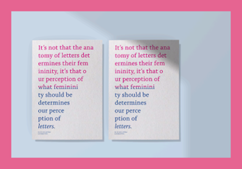
These biases appear in gendered typography, where blocky sans-serif typefaces such as Helvetica are often associated with strength, masculinity, and authority. In contrast, cursive typefaces are frequently perceived as feminine, elegant, or soft. This reflects the gendered norms of a patriarchal society, where masculinity is associated with power, dominance, and control, while femininity is associated with softness and delicacy. Typography thus reinforces binary gender norms alongside Eurocentric standards, as norms possess the power to impose meaning on seemingly neutral objects (Soulellis, 2021).
Typography as a Political Tool in Resistance Movements
Resistance extends beyond visible protest as it is part of a broader struggle against overlapping systems of power that determine who gets to be seen, heard, and remembered. These systems inevitably influence typography. Therefore, typography can reinforce dominant power structures, but it can also become a tool for resistance.
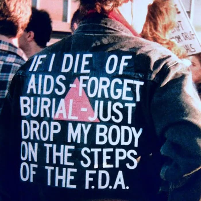
During the 1970s and 1980s, queer communities had little access to mainstream media platforms, and therefore turned to print as an alternative means of communication. Posters, flyers, and underground magazines allowed queer individuals to circulate information, organize politically, and create spaces of visibility outside political control. The result was handmade, improvised, and unpolished materials that challenged established standards. Rejecting the visual language of the institutions that had marginalized them, queer culture embraced disruption, transforming typography into a tool that questioned the status quo.
When discussing queer typography, it cannot be defined as a specific aesthetic, as it is not tied to a particular design. Robin Mientjes, a type and graphic designer, describes queer typography as an attitude, capturing how, at its core, it disrupts norms and refuses to conform to rigid rules. Rather than asking what queer typography is, it is more meaningful to ask how it is made. It is less a fixed state and more a process. It is not tied to a specific style but represents a critical approach to standardized typography. Replacing one system with another would not make sense; instead, it is more meaningful to disrupt the system that imposes heteronormative bias.
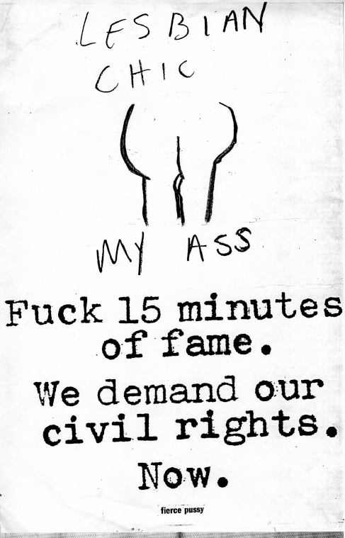
We can therefore move from asking “what is queer typography?” to “how is queer typography made?” To understand this process, we can examine the work of the collective Fierce Pussy.
Founded in New York in 1991, this group of queer women was deeply invested in AIDS activism, bringing lesbian identity and visibility to the forefront during the early years of the epidemic. Facing urgent mobilization needs and a limited to non-existent budget, they utilized available resources: old typewriters, vintage photographs, their own personal photos, and printing supplies they could access through their jobs. Despite those constraints, they distributed posters all over New York City. Their early work demonstrates that design was not an intentional aesthetic choice to disrupt typographic bias, but an act of urgency and resistance using limited tools. Ultimately, queer typography is not static, nor is it a specific style or a new typographic system. It is a process driven by conditions and decisions.
Sources
Soulellis, P. (2021). Urgent Publishing After the Artist’s Book: Making Public in Movements Towards Liberation. APRIA Journal, 3(3), 52–64.
Pesonen, R. (2025). IWAKAN: The role of typography in the publication’s thematic expression – a semiotic approach to analysing typography.